
Marketing toolkit
Use these resources to promote monthly payment options with ease
Select a toolkit item:
Logos and Co-Branding

Logos and Co-branding
At Wisetack, we love an easy experience for everyone. From the business that wants to deliver a great customer experience to the homeowner that likes paying monthly.
Our visual brand is easy too with clean lines, harmonious colors, and simple iconography. It’s easy on the eyes. It’s even easier to understand. It puts people and usability above flashy design.
Our visual brand is easy too with clean lines, harmonious colors, and simple iconography. It’s easy on the eyes. It’s even easier to understand. It puts people and usability above flashy design.
Logos
Our logo is a key element of our brand identity. It should always be reproduced and used as intended.
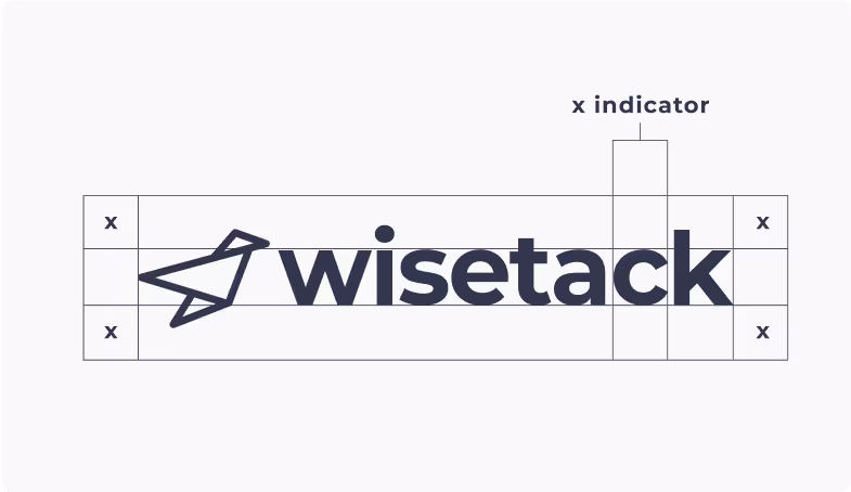
The logo should always have the bird icon to the left and the word mark to the right.
Always maintain a minimum clear space around the logo. The clear space isolates the logo from competing elements.
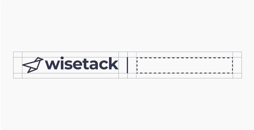
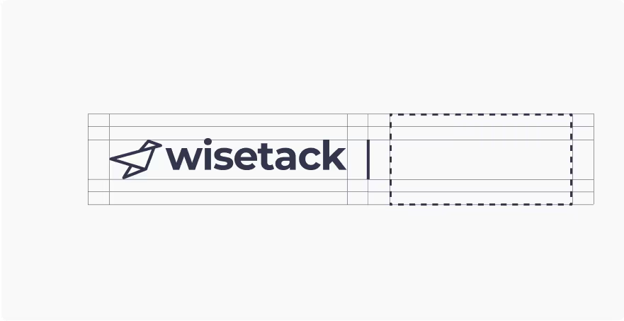
Co-branding
Wisetack logo guidelines should also be used when co-branding.
Lockup with a horizontal logo
Lockup with a vertical logo
For full brand and logo guidelines, visit our brand guide.
.svg)
.svg)
.svg)